Why “sometimes I hate” infographics
Ready…
In the growing map of data visualization field, I use to be a visualization tools developer; from there I speak about infographics and more.
There are several definitions and differences between visualization of information and infographics. I will use visualization as software-logic base representation of information and infographics as a free drawing technique, that means it started in Neolithic age. Infographic can be great to communicate since it has no limitations in terms of how you draw shapes, colors, lines or points.
I participate in great collective mapping projects, and I love the outcomes (1 ,2, 3) Infographics can definitelly be great.
Last times i reat ads seing: do amazing visualizations or infographics! You don’t need boring and long lists of tables and numbers, you don’t need statistics knowledge at all, just com and visualize”. This kind of sentences sound to me like the ones when I was a child and the electric organs and keyboards started to be a consumer product , The ads said: you don’t need to learn music! The organ was full of presets, rhythms and harmonies and the user could feel like a musician just selecting presets.
Set…
Usually, when you explain to someone why visualization is useful, the example of a long table with several columns and lot of numbers comes. If you take a glance at the table, hardly you will get the meaning or understand the evolution of the data on the table. Then it comes the idea of visualization of information.
What happens when I have a dataset like: [Women: 52.3%, Man: 47.7%]? How can I represent this, whether I need to? Do I really need to do design to visualize it? Tufte explains wery well how the graphic redundancy makes noise and changes the pure meaning of the data. Data-ink ratio in most of infographics tends to zero.
Data-ink ratio = ( data-ink / Total ink used to print the graphic ) = proportion of a graph’s ink devoted to the non-redundantdisplay of data-information.
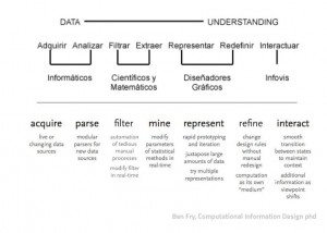
I really suffer from image intoxication (maybe #imageoxication?) and the times are already full of ads, so please, not abuse of non data-ink. Data is the blood of the visualization body. A information explorer can discover incredible precious stones in the data mines. Lot of people has been working in that process (see Ben Fry diagram bellow) and finally, a good graphic designer , IMHO, must take all that knowledge and feelings that comes with the cold data file and put the right amoung of sensibility on it and not cover everything woth tones of inked pixels.
Go!
I started saying I love infographics. Here I’m talking about the fashionable grow of infographics as a magical leverage that provides miraculous diagrams without any knowledge need it from the user.
Here is an incomplete list of anti-features (bugs) the infografics I hate have.
- Made using only commercial software ( I will write soon an entry about why and how important is the use of free software in opendata prohects).
- The strong affirmations of unclear concepts and/or the extreme simplification of complexity.
- Hides the process: audience has very few or even no information about the whole proces of the data. The criterious, categorizations, data massages, …
- Excess of ink (see comment above about data-ink).
- Is eye-catch driven design; closer to advertisement than scientific data analysis.
- Eye-candy excess that makes even not necessary to understand the data.
Finally… peace
The data visualization world needs a broad knowledge network of people working together in order to understand better and better the reality. Every one has the right to access to the data and I would add: every one has the right to understand the data.
The visualization works made without designers (see most of scientific papers) are cold, not communicating and using always the same elementary diagrams (bars, lines, pies,…). Yes.
And the designers working alone making one thousand infograpgics per day (this is the feeling I have last months) have the lack of data power: data integrity, data interaction and/or data discovering. Data without interaction is like a picture of a person compared to the person itself.
I like the use of infographic to explain things, for presentations, for lectures. In this sense, infographics is closer to writing or to comics-drawing than to data visualization,… and can be lovely. The current infographic excessive fashion… I hate it 🙂

